


August 2026 NEM spot prices were calm, not just low: cap payouts collapsed to near zero, batteries are flattening the evening peaks, and every region went negative together 137 times. Forward cap premiums have repriced sharply lower as a result.
August 2026 spot prices sat in the middle of the historical range, but the extremes that usually come with an Australian winter simply didn't show up. August $300/MWh cap payouts across the NEM fell to near zero, the intraday price shape kept flattening as battery output grew, and the forward curve cap premiums especially, repriced sharply lower across the board.
1.0 Summary
- August 2026 average spot prices were unremarkable — third- or fourth-lowest of the last eight August years in every region — but $300/MWh cap payouts (which only accrue above the $300/MWh cap-payout trigger), collapsed to essentially zero everywhere: $0.00/MWh in NSW and QLD, and no more than $0.04/MWh in SA, TAS or VIC. Two years ago, the same month delivered $26–$70/MWh in cap payouts across those same regions.
- The chance of price genuinely moving into extreme territory — the share of 5-minute dispatch intervals above $300/MWh — has averaged just 0.51% over the last four quarters, below even the unusually calm 2019–2021 period (0.59%) and under half the 2023–2025 average (1.46%). The contribution of the top price bands to the average price tells the same story: 39.4% of the average price in August 2024, just 0.2% in August 2026.
- VIC and SA are the clearest live test of this: on comparably low-wind days (a genuine wind "drought," the classic trigger for extreme prices in those two regions), average spot price is still 33–45% lower this August than last, for essentially the same wind conditions.
- Growing battery (BESS) charging demand during the day is not necessarily exceeding growth in solar capacity, but is acting as a sponge for the excess generation. However, the big impact is the evening peak where prices are no longer prone to push to extreme price levels.
- Solar's price-capture ratio (the price it actually earns relative to the plain time-weighted average) has fallen from 90% in 2020 to 42% so far in 2026, as more of its output clusters into the hours the market has already saturated — with curtailment nearly tripling over the same period. Wind shows the same pattern, more mildly.
- Forward cap premiums have nearly halved for Cal-27, falling 42–63% across NSW, QLD, SA and VIC over the past twelve months. This is a genuine repricing of volatility risk.
- Swap (base) forward prices are down 16–26% year-on-year across the same four regions, as the market prices in a calmer outlook further out the curve.
ASX options activity still leans heavily toward puts over calls in the prompt quarters — the market is still positioning for prices to surprise to the downside, not the upside. - Next summer's cap price (Q1-27, the quarter that matters most for peaking plant economics) has fallen 50–67% year-on-year across NSW, QLD, SA and VIC — roughly twice the percentage decline seen in the equivalent swap price. In a gross-pool market with no capacity payments, that's a direct hit to the main substitute peaking generators seek — and a fading opportunity for demand response providers too.
- August 2026 was a near-perfect month to have sold caps: sellers kept 75–100% of their locked-in premium (averaging ~88%), against just 21–29% for swap sellers (averaging ~25%) over the same month.
2.0 Dampened spot market volatility
The headline number that usually gets attention — the average spot price — doesn't tell the story this year. NSW averaged $75.71/MWh in August 2026, only the third-lowest of the last eight Augusts; QLD, SA and VIC were similarly mid-pack.
Table 1: August average spot price by region ($/MWh)
| Year | NSW | QLD | SA | TAS | VIC |
|---|---|---|---|---|---|
| 2019 | 83.6 | 61.6 | 75.2 | 72.8 | 104.1 |
| 2020 | 49.9 | 30.5 | 45.6 | 55.7 | 53.7 |
| 2021 | 60.1 | 53.5 | 43.4 | 21.5 | 47.0 |
| 2022 | 148.3 | 133.5 | 173.0 | 149.5 | 121.0 |
| 2023 | 93.3 | 67.6 | 160.3 | 37.7 | 64.7 |
| 2024 | 174.4 | 130.1 | 149.5 | 128.7 | 143.4 |
| 2025 | 101.2 | 78.2 | 86.9 | 125.2 | 93.2 |
| 2026 | 75.7 | 60.4 | 71.6 | 58.0 | 60.4 |
Figure 1: 25-year history of August average spot prices, NEM-wide
The monthly series of spot prices reflect the softened price era most regions are experiencing. Although:
- South Australia has had a bumpy ride this year, and is tracking stronger than other regions
- Victoria has tracked stronger across the start of winter since May 2026
- Tasmanian prices reset since January 2026, although Basslink which is now regulated from 1 July 2026, is contributing to cause prices on a like-for-like basis to be much softer than 12-months ago
Figure 2: Monthly spot prices from January 2025, NEM wide
Where the real change shows up is in the extremes. Cap payout only accrues once the 5-minute spot price clears $300/MWh, so it is a direct measure of how much genuinely extreme pricing occurred. In August 2026, there was almost none. In just two years, NSW, SA and VIC have gone from cap payouts in the $60–70/MWh range in August to effectively nothing:
Table 2: August average cap payout by region ($/MWh)
| Year | NSW | QLD | SA | TAS | VIC |
|---|---|---|---|---|---|
| 2019 | 0.35 | 0.01 | 2.09 | 4.74 | 3.48 |
| 2020 | 1.43 | 0.22 | 1.45 | 0.61 | 1.42 |
| 2021 | 0.02 | 0.43 | 0.29 | 0.06 | 0.09 |
| 2022 | 1.67 | 3.93 | 57.64 | 11.73 | 4.39 |
| 2023 | 7.97 | 4.59 | 74.45 | 0.12 | 7.33 |
| 2024 | 65.54 | 28.76 | 70.07 | 26.18 | 61.44 |
| 2025 | 3.02 | 0.31 | 3.10 | 1.02 | 2.81 |
| 2026 | 0.00 | 0.00 | 0.04 | 0.03 | 0.02 |
The trend isn't confined to August — it shows up across the quarter as well, with three of the last four quarters landing below $4/MWh in cap payout, a level of quiet that hasn't persisted for many years.
Table 3: NEM-average cap payout by quarter ($/MWh)
| Quarter | Avg spot price | Cap payout |
|---|---|---|
| Q3-24 | 118.88 | 31.08 |
| Q4-24 | 88.33 | 17.29 |
| Q1-25 | 82.92 | 7.32 |
| Q2-25 | 140.18 | 37.04 |
| Q3-25 | 86.75 | 5.69 |
| Q4-25 | 49.62 | 2.58 |
| Q1-26 | 72.76 | 10.29 |
| Q2-26 | 74.12 | 3.02 |
| Q3-26 (qtd) | 69.59 | 2.93 |
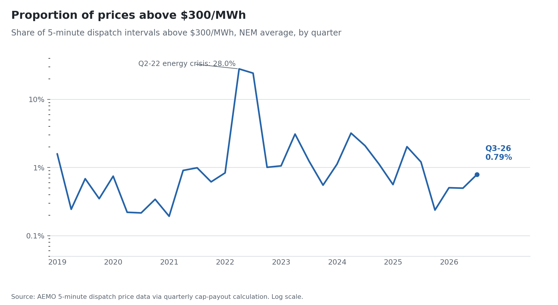
Looking at the longer history of the number of times spot prices exceed $300/MWh, Figure 4 shows the proportion of excursions by quarter, using a log scale due to the Global Energy Crisis of 2022.
Outside the 2022 energy crisis, this has always been a fairly rare event — even in the calmest years it's typically been somewhere between 0.2% and 1% of all dispatch intervals. What stands out about the last four quarters (Q4-25 through Q3-26) is that they've averaged just 0.51%, which is below the unusually calm 2019–2021 period (0.59% average) and well under half the 2023–2025 average of 1.46%.
Figure 4: Proportion of Above $300/MWh Events
Not only are cap payouts and the underlying prices softer, the chance of changing the outcomes is subdued. The Risk-of-Change measures the average price change if demand or supply moved more than 100 MW in the larger Regions, and 50 MW in SA and TAS.
Figure 3: Risk-of-Change since January 2024, NEM wide
Looking at the distribution of prices demonstrate how things have changed. Two things stand out, and they point in different directions. First, the share of the average price coming from the top price bands, the genuinely extreme end of the distribution, has collapsed. In August specifically, it went from 39.4% of the average price in 2024 to just 0.2% in 2026, echoing the cap-payout and risk-of-change findings above from another angle.
Second, the negative-price drag on the average hasn't been trending up the way growing solar penetration might suggest. If anything, the last two Augusts have had an unusually small negative contribution (−$2.39/ MWh in 2025, −$0.58/ MWh in 2026) against a noisier historical range that reached as deep as −$6.63/ MWh in 2024. The high-price extremes are fading in a clear, sustained way; the negative-price side looks more like a genuinely volatile, mean-reverting series than one with an obvious multi-year trend — at least so far, and at least in August.
Table 4: August price-distribution decomposition, NEM average, by year
| Year | Contribution from top bands (8–13), % of average price | Negative-price drag (bands 1–2), $/MWh |
|---|---|---|
| 2019 | 7.1% | −3.16 |
| 2020 | 3.6% | −1.66 |
| 2021 | 2.9% | −4.09 |
| 2022 | 25.8% | −4.00 |
| 2023 | 29.9% | −5.37 |
| 2024 | 39.4% | −6.63 |
| 2025 | 5.9% | −2.39 |
| 2026 | 0.2% | −0.58 |
Figure 4 shows the price band analysis for August.
Figure 4: Price Band Analysis
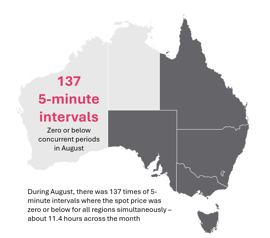
During the month, there was 137 times when all prices across each Region was simultaneously no more than zero during the month.
3.0 Battery impact
If spot prices are calmer, part of the explanation is showing up in how generation is dispatched across the day. Battery (BESS) output has grown enough over the past two years to start visibly smoothing the traditional evening price ramp, and it's increasingly adding demand to the daytime hours as rooftop and utility solar push prices down.
Figure 5 shows the normalised daytime prices are further below the average price for the month, and the morning and especially evening peak is lower than last year. Tasmania evening peak was the only exception.
Figure 5: August Normlaised Spot Prices
Now looking at the average generation profile by technology which are always rich stories to unpack. In this article we have focussed on BESS along with renewables, but you are welcome to explore the following charts by technology to draw-out the richness of the data. One is quick to learn in the electricity market that not every MW is of equal value. It is a question of timing.
Figure 6 shows the August story comparing 2026 versus 2025; while Figure 7 shows shows the year ending August 2026, versus the year ending August 2025.
Figure 6: Average daily generation by technology August 2026 versus August 2025
Figure 7: Average daily generation by technology year ending August 2026 versus year ending August 2025
Together these give two complementary views: Figure 6 is the direct month-on-month comparison (so it's the one most relevant to this article's specific August-on-August story, but can be swayed by one-off weather in either month), while Figure 7 smooths that out over a full trailing year, which is the better read on whether the shift is structural rather than a quirk of this particular August.
Using Figure 6, there has been a profound increase in BESS discharge average capacity across all mainland regions. Evening peak BESS has changed where:
- QLD grew from 486 MW to 1,221 MW
- NSW grew from 246 MW to 1,269 MW
- VIC grew from 538 MW to 740 MW
- SA grew from 226 MW to 191 MW
Looking at daytime demand increase from BESS charging compared to growth in solar renewables, we find:
- QLD charging BESS demand increased from 321 MW to 994 MW; but solar grew at a faster rate with utility solar increasing from 1,870 to 2,558 MW; and solar PV increasing by about 200 MW
- NSW charging BESS demand increased from 160 MW to 1,058 MW which was close to the growth in solar as utility solar increased by about 300 MW and solar PV by 700 MW
- VIC charging BESS demand increased from 351 MW to 662 MW; while utility solar grew by about 150 MW and very little change in solar PV
- SA charging BESS demand increased from 171 MW to 340 MW and utility solar grew by about 50 MW and no change to solar PV
Solar and wind continue to be the backdrop against this lower volatile market, and it is clear case of continual cannibalisation. The more a resource's own output clusters into the hours when everyone's output is high and price is already depressed, the further its captured price falls below the simple average.
Solar's is the more dramatic slide: it captured 90% of the average price in 2020 and is down to 42% in the first eight months of 2026, with curtailment nearly tripling over the same period (7.6% to 19.2%) as the release valve for the surplus it can't get paid for.
Wind's capture ratio has moved around more (2022–23's tight market lifted it to ~90%) but has still drifted down to the high-70s/low-80s over the last three years, with curtailment more than doubling off a low base.
This is the mechanism behind the shape story from a different angle. Solar in particular is generating an ever-larger share into the hours the market has already saturated, causing the daytime carve-out to become deeper and more difficult to recover; until we get more solar generation being stored and/or daytime demand growth.
Figure 8: Solar generation, curtailment and dispatch-weighted (capture) price vs time-weighted price
Figure 9: Wind generation, curtailment and dispatch-weighted (capture) price vs time-weighted price
The wind-price relationship is one of the most direct mechanical links in the whole article, and it matters most in VIC and SA. Both regions are wind-heavy, thinly-interconnected regions where a genuine wind "drought," especially one that coincides with a baseload outage, can turn into an extreme price event on its own. That makes it a useful test of whether this year's calm is really structural. If the market's propensity to spike has genuinely fallen, prices on similarly low-wind days should be lower this year than last, not just lower on average.
Restricting to comparably low-wind days in each region (daily wind output under 20,000 MWh, with near-identical average wind levels across the two years so the comparison is fair), VIC's average price on those days fell from $137.79/MWh last August to $76.41/MWh this August — a 45% drop for essentially the same supply conditions.
SA shows the same pattern: $144.15/MWh down to $96.57/MWh, a 33% fall.
Fitting a simple line through each year's full wind-price relationship confirms it isn't just a couple of unusual days doing the work: at a representative low-wind level of 10,000 MWh, the fitted price is $138.9/MWh in VIC last year versus $84.8/MWh this year (SA: $139.0/MWh versus $94.8/MWh). The wind-price relationship itself is still strongly negative in both years in both regions (correlation of roughly −0.7 to −0.8). A wind drought still moves the needle, it just moves it from a much lower starting point than it used to.
Table 6: VIC and SA — spot price on comparable low-wind days, August (wind < 20,000 MWh/day)
| Region | Avg wind, low-wind days — last year | Avg wind, low-wind days — this year | Avg spot price — last year | Avg spot price — this year | Change |
|---|---|---|---|---|---|
| VIC | 13,429 MWh | 12,777 MWh | $137.79 | $76.41 | −44.6% |
| SA | 10,604 MWh | 9,747 MWh | $144.15 | $96.57 | −33.0% |
Note: "Low-wind days" = daily wind generation under 20,000 MWh; 12 comparable days in each year for VIC, 12 (last year) vs 18 (this year) for SA. Average wind levels are close enough between years to treat the price comparison as like-for-like rather than an artefact of one year having windier "low-wind" days than the other.
Figure 10: Wind generation vs spot price, daily, August this year vs last year
4.0 Lower risk, lower forward prices
If the spot market has genuinely become less volatile, the forward curve should reflect it not just for the quarter that's about to expire, but further out the curve.
That's exactly what shows up when comparing where the market prices Cal-27 today against where it sat twelve months ago. Cal-27 forward price doesn't start delivering until January 2027, so there's no expiry effect at work here, only the market genuinely re-rating the odds of $300+/MWh events and the underlying prices. A near-halving of the cap premium over twelve months is about as direct a read on repriced volatility risk as the forward curve gives us.
Table 7: Cal-27 swap price, $/MWh (base load, flat profile)
| Region | ~Sep 2025 | Sep 2026 | Change |
|---|---|---|---|
| NSW | 114.95 | 85.30 | −25.8% |
| QLD | 97.12 | 76.08 | −21.7% |
| SA | 93.87 | 78.47 | −16.4% |
| VIC | 74.81 | 63.13 | −15.6% |
Table 8: Cal-27 cap price, $/MWh
| Region | ~Sep 2025 | Sep 2026 | Change |
|---|---|---|---|
| NSW | 27.42 | 10.45 | −61.9% |
| QLD | 21.60 | 7.97 | −63.1% |
| SA | 25.27 | 14.69 | −41.9% |
| VIC | 17.15 | 9.15 | −46.6% |
Figure 11 shows the forward price history for Cal-27 to Cal-29, and during August:
- QLD has strengthened
- NSW had mixed results with Cal-27 and Cal-28 slightly increasing, while Cal-29 softened which is the year Eraring is planned to close
- VIC strengthened, especially Cal-28 probably related to further press about preparations for Yallourn's planned closure
- SA softened appreciably in Cal-27, and to a lesser extent in Cal-28; but rallied in Cal-29
- TAS slightly increased in Cal-27 and Cal-28, but softened in Cal-29
Figure 11: Cal-27 to Cal-29 Forward Prices
5.0 ASX trading activity
Figure 12 shows the traded volumes by product since January 2024, and it is noticeable that the August volumes continue to track above last year for the same period, with average rate options and $300/MWh caps driving the increase.
Figure 12: Monthly Traded ASX Quantities Jan-24 to Aug-26
During August, the most active quarter trades were swaps and Put Average Rate Options, and as usual, the near quarters was the focus. Figure 13 presents the results and unlike Figure 12, this dataset excludes calendar and financial year strips.
Figure 13: Traded ASX Quantities Jan-24 to Aug-26
Two things stand out in the August traded-volume data. First, cap volume is consistently well below swap volume (roughly a third to a half) across every future quarter shown; unsurprising given cap premiums have fallen as far as they have (Tables 7–8), reducing the incentive to buy cap protection at all.
Second, and more telling for sentiment the Put Average Rate Option volume dramatically outweighs Call volume in the two nearest quarters (13x in Q3-26 and 3x in Q4-26), before that skew fades and then reverses further out the curve (Q1-27 near-balanced, Q2-27 tilted back toward calls).
This pattern implies the market is still actively positioning for prices to undershoot over the next two quarters specifically, even as it's become far less worried about prices spiking. It is a market that's stopped pricing in near-term upside surprises but hasn't yet stopped worrying about further downside.
Table 10: ASX traded volume by product, near-term quarters (MW)
| Quarter | Swap | Cap | Call | Put | Cap/Swap | Put/Call |
|---|---|---|---|---|---|---|
| Q3-26 | 1,415 | 532 | 101 | 1,311 | 0.38 | 12.98 |
| Q4-26 | 1,600 | 579 | 1,259 | 3,877 | 0.36 | 3.08 |
| Q1-27 | 1,758 | 771 | 2,590 | 3,877 | 0.44 | 1.50 |
| Q2-27 | 839 | 231 | 1,050 | 450 | 0.28 | 0.43 |
6.0 Cap and swap seller profit
August 2026 was a good month to have sold either instrument, but not equally good. Cap sellers walked away with almost the entire premium they'd been paid, while swap sellers kept only a modest slice of the value locked into their contract.
For a cap, the most a seller can ever make is the full premium as payouts only ever eat into it or surpass the premium. This month was about as close to the best-case outcome as that instrument gets. A swap seller's profit, by contrast, is simply the gap between the fixed price they locked in and wherever spot pay-out happened to occur, and this August that gap was real but nowhere near the full contract value.
Table 11: Cap and swap seller economics, by region, August 2026 ($/MWh)
| Region | Instrument | Forward (locked-in value) | Paid out / spot outcome | Net profit to seller | Profit as % of locked-in value |
|---|---|---|---|---|---|
| NSW | Cap | 21.02 | 0.07 | 20.95 | 99.7% |
| QLD | Cap | 13.98 | 0.00 | 13.98 | 100.0% |
| SA | Cap | 22.11 | 5.45 | 16.65 | 75.3% |
| VIC | Cap | 12.34 | 2.82 | 9.52 | 77.1% |
| NSW | Swap | 109.47 | 77.68 | 31.79 | 29.0% |
| QLD | Swap | 86.03 | 62.32 | 23.72 | 27.6% |
| SA | Swap | 104.48 | 82.51 | 21.97 | 21.0% |
| VIC | Swap | 83.29 | 64.02 | 19.27 | 23.1% |
Note: For Cap rows, "paid out / spot outcome" is the actual cap payout for August; for Swap rows it's the actual average spot price achieved. Net profit = Forward − that figure in both cases.
Figure 14: Cap and swap seller profit, August 2026
The percentage column is where the cap seller's advantage really shows up. Across the four regions, cap sellers retained 75–100% of their locked-in premium as pure profit (averaging ~88%), while swap sellers retained only 21–29% of theirs, averaging ~25%.
In raw $/MWh terms the swap seller's margin looks larger (it's paid on a much bigger base price), but that's the wrong comparison. Relative to what each seller had actually put on the table, the cap seller came away with nearly the entire value of the position, and the swap seller with roughly a quarter of it. That's the clearest possible illustration of this article's whole argument from the seller's side of the ledger. A quiet month is close to a perfect outcome if you sold volatility protection, and merely a good one if you sold a fixed price.
7.0 Peaking plant and demand response
The NEM is a gross-pool market so generators are paid the spot price for their output and there is no separate capacity payment for simply being available to run. For a peaking plant (open-cycle gas, in most cases), the closest substitute for a capacity payment has always been selling $300/MWh caps. By doing so, collect the premium up front, and if the cap doesn't get triggered, that premium is close to pure margin for a unit that otherwise sits idle most of the year. It's effectively the market's way of paying peaking capacity to exist, without a formal capacity mechanism.
That makes the forward cap curve worth reading specifically through a peaking-plant lens and Q1 is the premium quarter because it is typically where the bulk of $300+ events cluster. Consequently, the forward market commands the highest premium, roughly double other quarters.
Against that backdrop, the cap has fallen roughly twice as far, in percentage terms, as the swap in every region. This isn't just "prices are lower everywhere," it's volatility-risk specifically being repriced down. NSW's Q1-27 cap has now fallen 71% from its own May-2024 peak of $53.35/MWh, over a year before that quarter even begins.
Table 13: Q1-27 cap and swap price, ~Sep 2025 vs Sep 2026
| Region | Cap Sep-25 | Cap Sep-26 | Cap change | Swap Sep-25 | Swap Sep-26 | Swap change |
|---|---|---|---|---|---|---|
| NSW | 37.50 | 15.50 | −58.7% | 119.00 | 84.50 | −29.0% |
| QLD | 39.06 | 13.00 | −66.7% | 120.89 | 81.50 | −32.6% |
| SA | 42.80 | 21.50 | −49.8% | 98.50 | 77.25 | −21.6% |
| VIC | 27.77 | 14.00 | −49.6% | 74.18 | 58.35 | −21.3% |
It's also not a one-year blip. Looking at the same forward horizon each year on how the market priced the upcoming summer quarter's cap and swap as at the end of August. Across the last three years shows the same pattern building, then sharply accelerating.
Two things stand out. First, the cap has fallen further than the swap at every single step in every region, confirming again that this is about volatility risk specifically, not just softer prices generally. Second, this is a two-stage move where the year to August 2025 saw only modest cap softening (single digits to −24%) with swap prices roughly flat. But the year to August 2026 saw both legs fall sharply everywhere, with cap declines of −45% to −68% on top of swap declines of −20% to −36%. This effect has clearly intensified over the past twelve months rather than gradually fading in.
Table 14: Next-summer cap price, as priced at end of August each year ($/MWh)
| Region | Q1-25 (end-Aug-24) | Q1-26 (end-Aug-25) | Q1-27 (end-Aug-26) | Aug24→25 | Aug25→26 | Total |
|---|---|---|---|---|---|---|
| NSW | 42.95 | 36.60 | 15.40 | −14.8% | −57.9% | −64.1% |
| QLD | 45.50 | 41.60 | 13.15 | −8.6% | −68.4% | −71.1% |
| SA | 53.50 | 40.50 | 21.50 | −24.3% | −46.9% | −59.8% |
| VIC | 28.75 | 26.00 | 14.40 | −9.6% | −44.6% | −49.9% |
Table 15: Next-summer swap price, same basis ($/MWh)
| Region | Q1-25 (end-Aug-24) | Q1-26 (end-Aug-25) | Q1-27 (end-Aug-26) | Aug24→25 | Aug25→26 | Total |
|---|---|---|---|---|---|---|
| NSW | 122.00 | 120.60 | 84.77 | −1.1% | −29.7% | −30.5% |
| QLD | 131.00 | 126.79 | 80.70 | −3.2% | −36.4% | −38.4% |
| SA | 114.35 | 96.75 | 77.00 | −15.4% | −20.4% | −32.7% |
| VIC | 71.75 | 75.75 | 58.85 | +5.6% | −22.3% | −18.0% |
If this holds, it's a real headwind for peaking plant revenue as it is the main compensation available to a unit whose job is to be there for the rare extreme event is shrinking, even as the extreme events themselves become rarer. Individually that's a rational market response to falling risk. Collectively, if it goes far enough, it weakens the economic case for keeping marginal peaking capacity available (or for building more of it), which matters precisely because that capacity is what the system falls back on the next time a genuine tail event (e.g. an extended low-wind heatwave or cold wave), does show up.
The same logic applies to consumers offering demand response. Their opportunity is the mirror image of the peaking generator's. Getting paid through wholesale price exposure, a retailer pass-through, or a dedicated DSR mechanism for curtailing load precisely when prices spike. If those spikes are becoming rarer and smaller, the revenue available for offering that flexibility fades for exactly the same reason it's fading for peaking plant. Both sides of the market's tail-risk safety net are being paid less to stand ready, at the same time the events they exist for are (for now) not showing up.
8.0 Putting it together
None of the threads here stand alone. Spot prices didn't need to hit record lows for the market to feel calmer; they just needed the extremes to stop showing up. Growing battery output is a plausible market reason where BESS is filling exactly the hours that used to produce the sharpest price ramps, both on the direct August-on-August comparison and on the smoothed 12-month view.
Forward cap premiums past the current quarter have softened, and options positioning are still tilted toward downside protection near-term, and cap sellers have walked away with close to their entire premium in August. Pricing reflects a calmer, softer future world, not just reacting to how the current quarter happens to be settling.
Whether this trend holds is the open question. Battery capacity keeps being added, but so does demand growth from electrification, Data Centre growth, and a single hot, low-wind week can still re-test the market. There's also a slower-moving risk worth watching where if falling cap and DSR revenue genuinely discourages peaking plant and demand-side flexibility from sticking around, the system could end up less prepared for exactly the kind of event that would bring volatility back. For now, though, the data says the market has genuinely re-rated the risk — not just gotten lucky for a quarter.
Disclaimer and Notes
Energybyte is published by Empower Analytics Pty Ltd (ABN 38630239002), Authorised Representative no 1274453 of Capital Treasury Solutions (AFSL 429066). Any questions or feedback must be directed to Empower Analytics Pty Ltd as the sole publisher.
